Choosing the right color and pattern for your home decor can be a daunting task. With so many options available, it’s important to consider a few key factors that will ensure you make the best choice. From the overall theme and style of your space to the mood and ambiance you want to create, this article will guide you through the important considerations when selecting colors and patterns for your home. Whether you’re aiming for a bold and energetic look or a calm and soothing atmosphere, you’ll find the insights you need to create a space that truly reflects your personal taste and preferences.

Understanding the Purpose
When choosing the right colors and patterns for a room, it is essential to first understand the purpose of the space. Consider how the room will be used and what activities will take place in it. Is it a bedroom that needs to create a calm and restful atmosphere? Or perhaps a lively living room meant for entertaining guests? Understanding the room’s function will help guide your color and pattern choices.
Considering the room’s function
Depending on the function of the room, different colors and patterns will evoke specific emotions and set the desired mood. For example, vibrant and energetic colors like red or yellow can be great for a creative space or playroom, while cooler and more neutral tones like blue or green may be better suited for a bedroom or study area where relaxation and focus are essential.
Evaluating the mood or atmosphere
In addition to considering the function of the room, think about the desired mood or atmosphere you want to create. Are you aiming for a cozy and intimate space, or a bright and airy one? Colors can greatly impact the atmosphere of a room, so choose them wisely. Warm tones such as red, orange, and yellow can create a welcoming and intimate feel, while cool colors like blue and green can bring a sense of calm and serenity.
Thinking about the desired impact
Lastly, think about the impact you want to achieve with your color and pattern choices. Do you want to make a bold statement or create a subtle and harmonious look? Consider the overall aesthetic you want to achieve and how the colors and patterns can contribute to it. Remember that colors and patterns have the power to transform a room, so choose ones that align with your vision and desired impact.
Considering Existing Decor
Before diving into color and pattern selection, it’s important to assess the existing decor of the room. Look at the furniture, accessories, and overall style to determine the best colors and patterns that will harmonize with the existing elements.
Assessing furniture and accessories
Take note of the colors and patterns already present in the room’s furniture and accessories. Consider whether you want to match these elements or create a contrasting look. Matching the colors and patterns can create a cohesive and balanced feel, while contrasting can add visual interest and excitement.
Matching or contrasting with walls and floors
In addition to the furniture and accessories, take into account the colors and patterns of the walls and floors. If they already have a busy pattern or a bold color, choosing a simpler and more subdued color or pattern for the furnishings may be wise. On the other hand, if the walls and floors are more neutral, you have more freedom to be bold and adventurous with your choices.
Analyzing Natural Light
Natural light is a crucial factor to consider when choosing colors and patterns. The direction and intensity of sunlight in a room can greatly influence how colors appear and the overall ambiance.
Identifying the direction of sunlight
Observe the direction from which natural light enters the room. Rooms with windows facing the east receive more sunlight in the morning, while those facing the west have sunsets that bathe the space in warm light. Rooms facing the north tend to have cooler and softer light throughout the day, while those facing the south receive the most direct and intense sunlight.
Considering the intensity of natural light
Take into account the intensity of natural light in the room. Does it flood the space with brightness, or is it more subdued and filtered? Remember that colors can appear differently depending on the amount and quality of light they are exposed to. Strong natural light can make colors appear more vibrant, while dimmer light can make them look duller. Consider this when selecting colors and patterns to ensure they look as intended under the room’s natural lighting conditions.
Room Size and Shape
The size and shape of a room play a crucial role in color and pattern selection. They can be visually enhanced or diminished through strategic color and pattern choices.
Using colors to visually expand or contract the space
Colors have the power to visually manipulate the size of a room. Lighter colors, such as whites and pastels, tend to make a space look larger and more open, while darker colors can create a cozy and intimate feel. If you have a small room, consider using lighter shades to expand the visual space. In contrast, if you have a large room that feels too cavernous, darker colors can help create a more intimate atmosphere.
Using patterns to enhance or diminish room proportions
Similar to colors, patterns can have a significant impact on the perception of room size and shape. Vertical patterns, such as stripes or cascading vines, can visually elongate the height of a room. Conversely, horizontal patterns, like a wide checkered design, can make a room appear wider. If you have a room with an awkward shape, carefully chosen patterns can help balance out the proportions and make the space feel more harmonious.

Color Psychology
Understanding the psychological effects of colors is important when selecting colors and patterns for a room. Different colors can evoke various emotions and have distinct impacts on our mood and well-being.
Understanding the psychological effects of colors
Colors have the power to influence our emotions and behavior. For example, blue is often associated with calmness and serenity, making it an excellent choice for bedrooms or spaces meant for relaxation. On the other hand, yellow is a color that represents happiness and energy, making it suitable for areas where creativity and productivity are desired. Consider the psychology of colors and aim to create a room that aligns with the desired emotional impact.
Choosing colors based on their impact on emotions
When selecting colors, think about the emotions and feelings you want to evoke in the room. If you want to create a space that promotes tranquility and peace, opt for cool tones like blues and greens. If you’re aiming for a room that exudes warmth and energy, consider using warmer shades like oranges and yellows. By choosing colors that align with the desired emotional impact, you can create a space that promotes a positive and inviting atmosphere.
Color Harmony
Achieving color harmony within a room is essential to create a visually appealing and cohesive look. There are various color schemes and palettes that can enhance the overall aesthetic of a space.
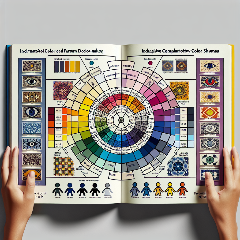
Exploring complementary color schemes
Complementary colors are those that are opposite each other on the color wheel, such as blue and orange or red and green. Using complementary colors can create a striking and vibrant look, as these hues intensify each other when placed side by side. Consider incorporating complementary colors in your color scheme to add visual interest and create a dynamic focal point within the room.
Using analogous colors for a cohesive look
Analogous colors are those that are adjacent to each other on the color wheel, such as blue and green or red and orange. These colors share similar undertones and create a harmonious and cohesive look when combined. Utilizing analogous colors in your color palette can create a sense of unity and balance within the room.
Experimenting with monochromatic palettes
Monochromatic color schemes involve using different shades, tints, and tones of a single color. This creates a refined and sophisticated look, as the different variations of the same color add depth and interest. Experiment with monochromatic palettes to achieve a timeless and elegant aesthetic within your space.
Pattern Scale and Proportion
When incorporating patterns into a room, it is essential to consider scale and proportion. Choosing the appropriate pattern scale ensures that it complements the dimensions of the room and other elements within it.
Matching pattern scale with room dimensions
Smaller patterns tend to work better in smaller rooms, as they don’t overwhelm the space and create a sense of busyness. Conversely, larger patterns can be used in larger rooms to add drama and visual interest. Consider the dimensions of the room and the overall size of the furniture and accessories when selecting pattern scales. This will ensure that the patterns harmonize with the room’s proportions and don’t overpower the space.
Choosing appropriate pattern proportions
In addition to considering the pattern scale, think about the proportions of the patterns themselves. Some patterns have bold and prominent motifs, while others have smaller and more delicate designs. Choose patterns that align with the overall style of the room and the desired visual impact. Strive for a balance of pattern proportions to create a visually pleasing and cohesive look.
Pattern Coordination
Mixing patterns within a room can add texture, depth, and visual interest. However, it requires careful coordination to ensure that the patterns complement each other and create a cohesive overall look.
Creating a focal point with patterns
One effective way to incorporate patterns is by creating a focal point within the room. Choose one dominant pattern that will serve as the focal point and then select complementary or coordinating patterns to support it. This approach ensures that the patterns work together rather than compete for attention. For example, if you have a boldly patterned wallpaper, select simpler and more understated patterns for the upholstery and curtains.
Mixing patterns to add visual interest
To add visual interest and depth, experiment with mixing patterns throughout the room. However, be mindful of striking a balance between the different patterns. Aim for a mix of scales, such as pairing a large floral print with a smaller geometric pattern. Also, consider varying the intensity of the patterns, mixing busy patterns with more subdued ones. This creates a harmonious and visually engaging space.
Maintenance Considerations
When choosing colors and patterns, it’s important to consider the practical aspects of maintenance. Assess the cleaning and upkeep required for the chosen colors and patterns, as well as their durability and longevity.
Assessing the cleaning and upkeep required
Different colors and patterns may require different levels of maintenance. Lighter colors may show stains and dirt more easily, requiring more frequent cleaning. Consider whether the selected colors and patterns are suitable for your lifestyle and the level of maintenance you are willing to commit to. Opting for materials and finishes that are easy to clean and maintain can save time and effort in the long run.
Considering the durability and longevity of colors and patterns
In addition to maintenance, consider the durability and longevity of the chosen colors and patterns. Some materials and finishes may fade or wear over time, while others are more resistant to fading and damage. Invest in high-quality materials and finishes that will stand the test of time and maintain their aesthetic appeal. This ensures that your chosen colors and patterns will continue to look great and withstand daily wear and tear.
Personal Preferences
Ultimately, when choosing colors and patterns for a room, it’s important to reflect your personal taste and style. Consider what colors and patterns resonate with you and make you feel comfortable and happy in your space.
Reflecting individual taste and style
Your home is a reflection of your personality and style, so don’t be afraid to incorporate colors and patterns that you love and resonate with. Whether you prefer bold and vibrant hues or prefer a more subdued and neutral palette, choose colors and patterns that align with your personal taste. This will create a space that feels authentic and truly represents you.
Considering long-term satisfaction
While personal taste is important, also consider long-term satisfaction when selecting colors and patterns. Trends come and go, so choosing timeless colors and classic patterns can ensure that your space remains visually appealing and doesn’t feel outdated quickly. Balance your personal preferences with a sense of timelessness to create a space that you will continue to love for years to come.
In conclusion, choosing the right colors and patterns for a room goes beyond mere aesthetics. It involves understanding the purpose of the space, considering existing decor, analyzing natural light, assessing room size and shape, understanding color psychology, achieving color harmony, considering pattern scale and proportion, coordinating patterns, considering maintenance, and reflecting personal preferences. By carefully considering all these factors, you can create a room that not only looks visually appealing but also enhances the desired atmosphere and reflects your individual style.